municiPal
The municiPal app informs people about stories and events happening at the state and local level and connects them to tools that they can use to help make a difference in their communities.
Overview
Problem: Interest and engagement in local news and politics has been in decline. In Eitan Hersh’s book Politics Is for Power, he notes that from 1990 to 2014, regular newspaper readership and local television viewership plunged from over 70 percent to under 59 percent of the population, and that while online news consumption increased, online readers opt for national news sources rather than local ones. Hersh’s book describes how a lot of political engagement in the United States today is a form of political hobbyism. This term describes voters who follow national news and politics, donate to national political candidates and vote in national elections but are not active in local or state politics.
Challenge: To revive interest and engagement in local politics and events. By emphasizing calls to action within in-app content, municiPal gives people tools to respond to what is happening in their community and state, whether that be through signing petitions, contacting representatives, attending meetings and events, or getting connected with local organizations.
Project: This app was designed in a group project for Industrial and Systems Engineering 552: Human Factors Engineering Design and Evaluation taught by Professor John Lee at the University of Wisconsin-Madison.
My Role: UI/UX Designer, UX Researcher
Timeline: January - May 2020, Refined in March 2021
Group Members: Kenan Biren, Anish Trakru, Alex Wistrom
Tools: Adobe XD, Adobe Illustrator, Affinity Designer
My Contribution: For this project, I helped conduct user research through contextual interviews that explored users’ consumption of political news, current events and their reactions to a handful of political and news websites. Using the contextual inquiry method, I worked with my group to create work models and an affinity diagram to help us understand the user data that was collected. From the findings in our work models, we created user environment designs, an interaction design and a low-fidelity prototype before designing our final interactive prototype.
I was the primary visual designer of the final prototype of the app. I designed the app’s logo in Affinity Designer, selected the color palette, icons and images and designed most of the screens in the final prototype. I made additional refinements to the design in March 2021.
The Process
In our course, we used the Contextual Design process developed by Karen Holtzblatt and Hugh Beyer to immerse ourselves in the lives of users and help us understand their needs, habits, and sources of joy and frustration in order to design an innovative product that is a joy to use and meets users’ needs.
Contextual Inquiry + Interpretation Session
We began this project with an idea for a mobile app that would inform voters about the voting records and platforms of their representatives and political candidates and allow users to compare their own political views with the views of politicians. We imagined that the app would feature news stories and current political debates as well.
To begin our research, we conducted contextual interviews with users that focused on their consumption of news and got their feedback and observations on some political and news websites. The scope of our interview was rather broad and looked at what issues were important to them, how frequently they followed the news and why they gravitated toward particular news and media sources. This process helped us filter out the partisan bias of the people we interviewed and allowed us to identify key commonalities between users. Following our contextual interviews, we met as a team and had an interpretation session that helped give context to the user data that collected. In the session, we used affinity mapping to organize the key insights that we gathered from the interviews.
“I don’t like reading celebrity political news—I don’t like when it’s covered. It’s important to have news that reflects facts instead of just an opinion.”
Affinity Diagramming + Work Models
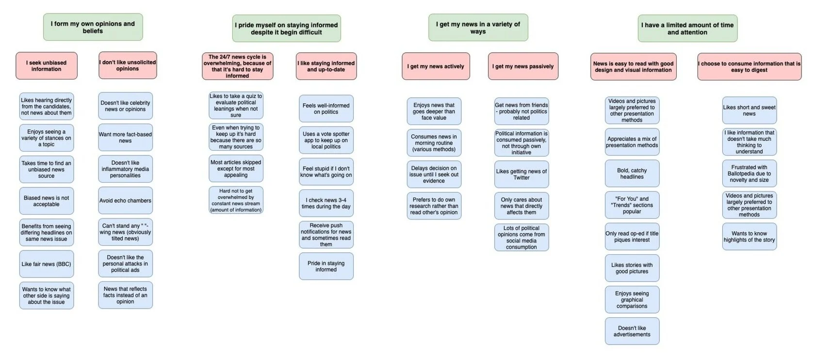
Affinity Diagram: The Affinity Diagram helped us organize the notes from our contextual interviews and interpretations session and draw as much useful information out from them as possible. It revealed what attracts users, how they get their daily news, and the format of news they prefer. It also helped us understand that users want to consume unbiased, objective information and that they like to form their own opinions.
The Affinity Diagram below is a hierarchy of information organized from the bottom up. We began by grouping together notes from our interviews (blue) and organized them under similar issues and themes (pink). Issues and themes were then organized under big ideas and concepts (green).
Day-in-the-Life Model: We created the Day-in-the-Life Model to help us understand how a typical person overcomes the struggle to stay informed. This model revealed how users use different news sources throughout the day to stay informed and up-to-date.
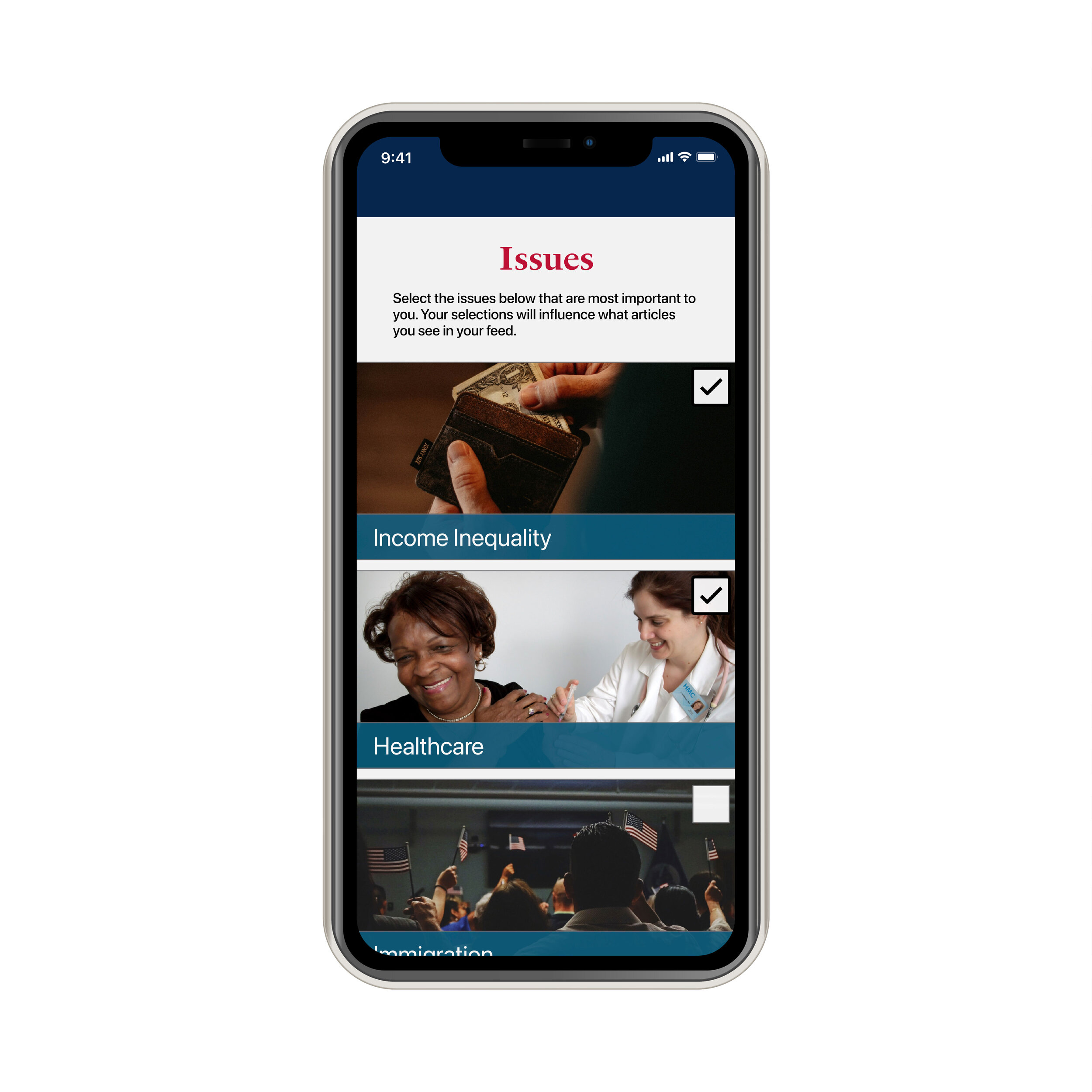
A specific challenge documented in the Day-in-the-Life model was that users often find consuming news to be overwhelming. Based on that insight, our app would allow users to customize news. For example, a user can choose to only see news articles based on topics that are of interest to them like healthcare, immigration, racial justice, etc. To keep informed throughout the day, a user can also opt for push notifications for articles centered around their issues of interest.
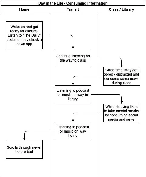
Day-in-the-Life Model
Identity Model: We created the Identity Model because news consumption is greatly influenced by a user’s beliefs and personality. Our Identity Model revealed that users like to form their own opinions and look for topics or issues that are relatable. To account for this, the news in our app would have to be unbiased, based on facts and not draw conclusions, providing users the freedom to form their own viewpoints.
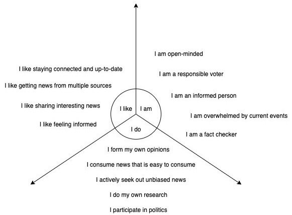
Identity Model
User Environment Design
At this point in the design process, we started to focus on and consider the type of news that users would get and what we wanted the app to center around. We wrestled with whether users really wanted another news app to look at every day, especially since a lot of users noted in their interviews that they often felt overwhelmed by the news. It became clear that some of the ideas we had originally around the app would likely only appeal to a demographic of voters who already closely followed politics. Our professor mentioned political scientist Eitan Hersh’s book Politics Is for Power, and noted that the direction that our app was taking may only contribute to what Hersh describes as political hobbyism. I was familiar with Hersh’s work as I had listened to part of an interview with him on a podcast and was intrigued by his argument that the key to improving political engagement in the United States is to focus on local news and politics:
Just from 1990 to 2014, regular newspaper readership and local television viewership plunged from over 70 percent to under 59 percent of the population. Online news consumption increased, but online readers opt for national news sources rather than local ones.
- Eitan Hersh, p. 19, Politics Is for Power
We decided to shift the app’s focus toward news and politics on the state and local level in order to encourage political action and increase familiarity with users’ state and local representatives and fill in the gap left by the decline and lack of interest in local news sources.
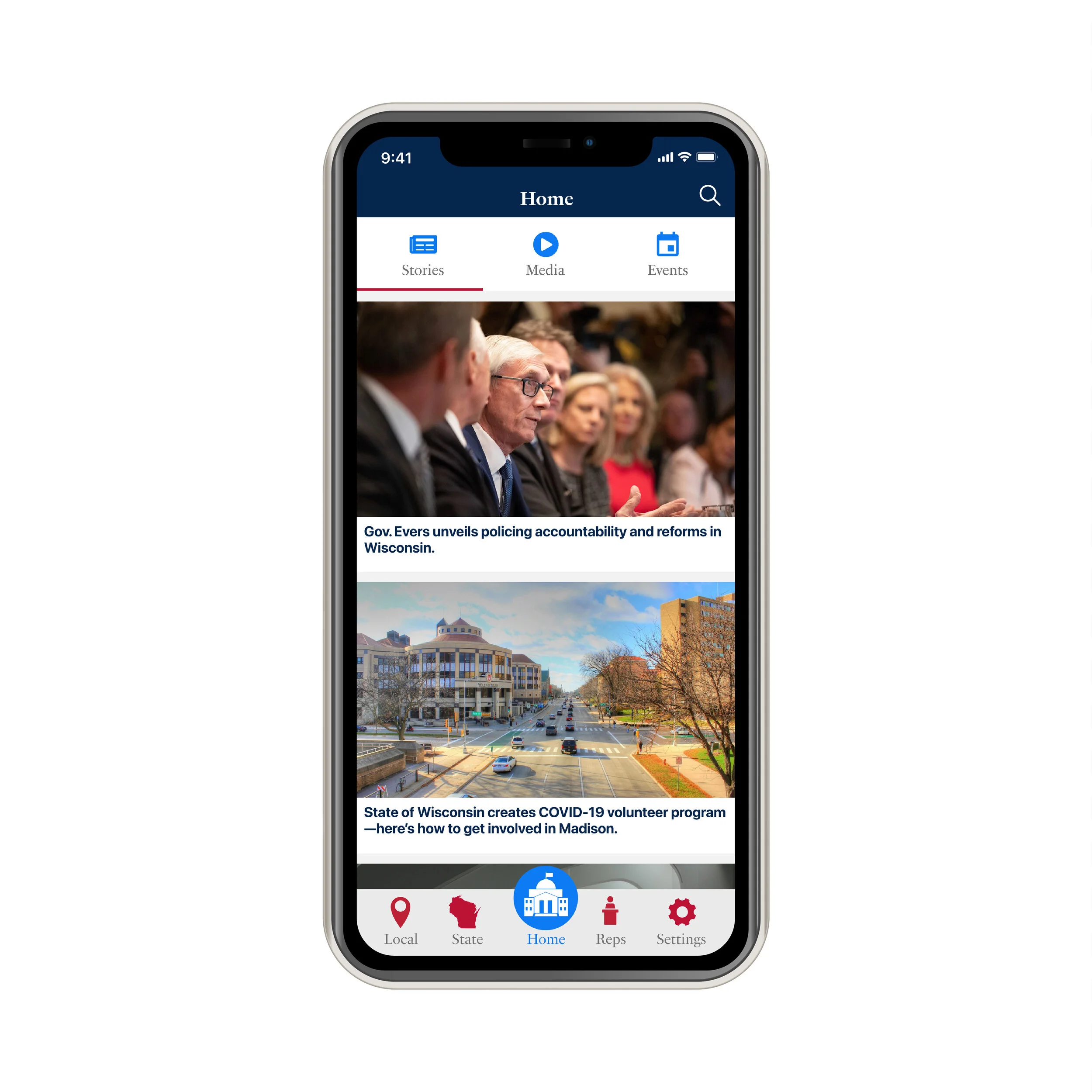
The metaphor of the local newspaper is apparent in our User Environment Design in the way that our navigation has been structured to split state, local and a handful of national news stories, as is often done in local newspapers, while also including profiles and interviews of local and state leaders so that readers can be introduced to those that are representing them. Our emphasis on the call to action around also reflects how local newspapers include information about local events, meeting times for civic functions, and state and local interest groups.
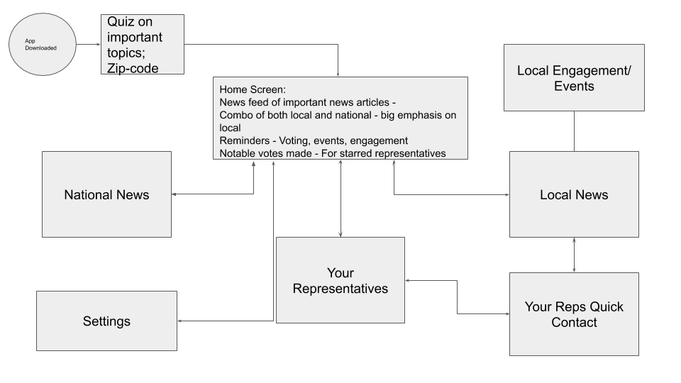
User Environment Design #1
User Journey
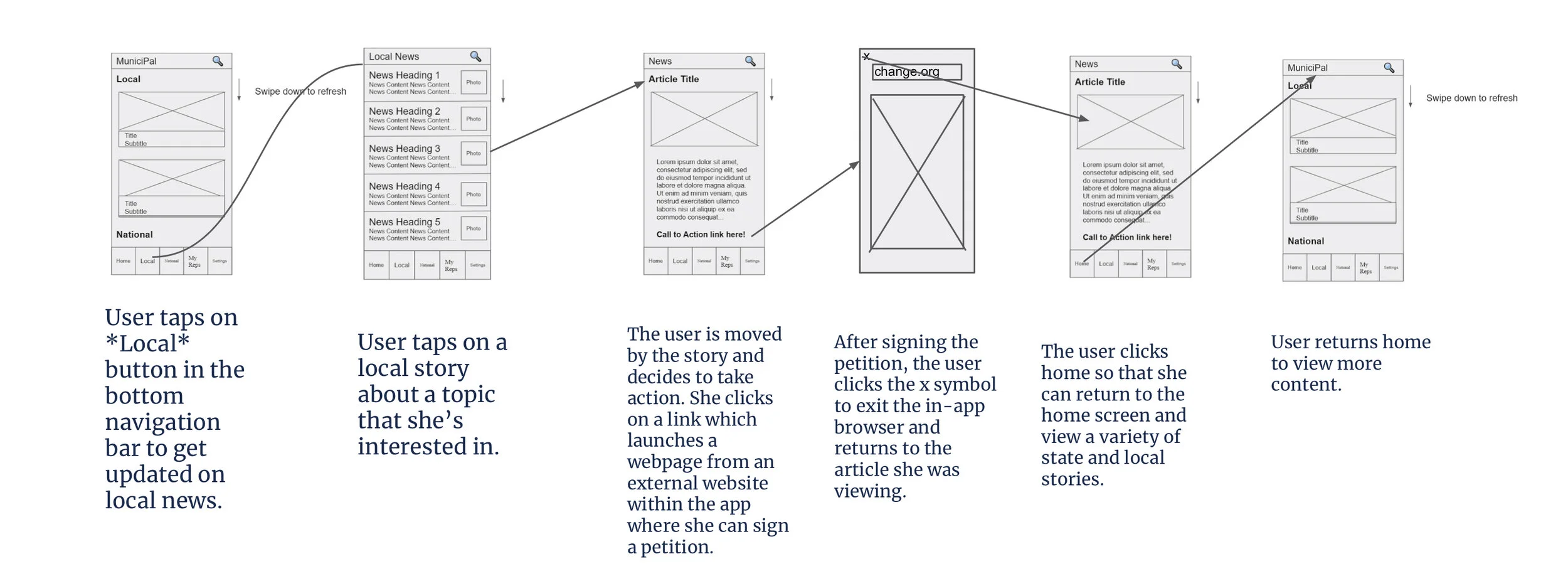
The User Environment Design showed us the important divisions and links between content. We created user journeys that reflect those divisions and links intuitively. The user journey below shows a user, Jo, who is interested in a topic and gets a push notification later in the week to stay up to date on that topic. The user journey on the right shows a user who reads a story and then decides to take action by signing a petition.
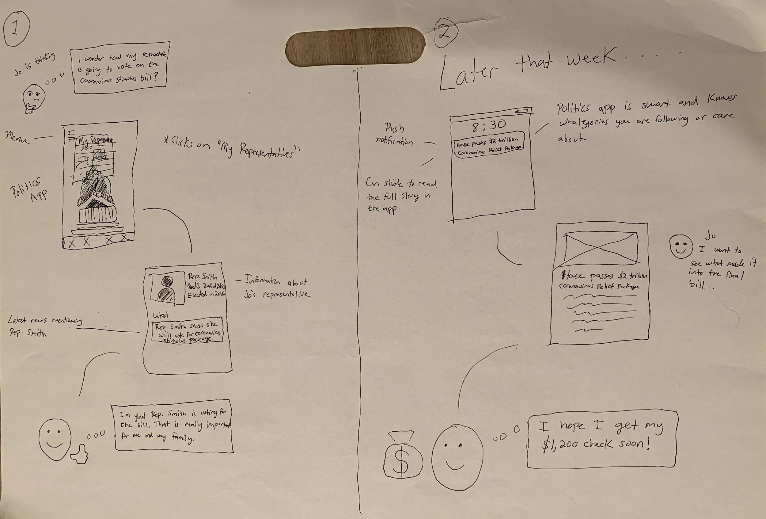
User Flow
This task flow shows shows a regular user opening the app, reading an article, and deciding to act on a story that she read.
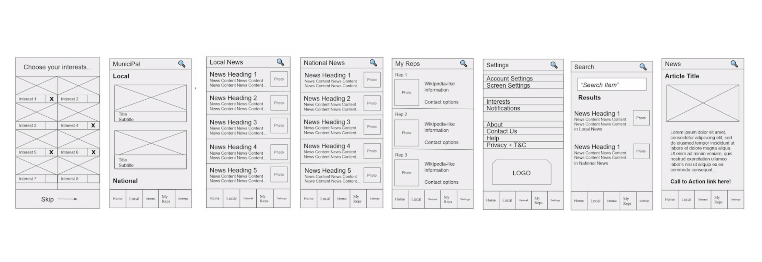
Low-fidelity Prototype
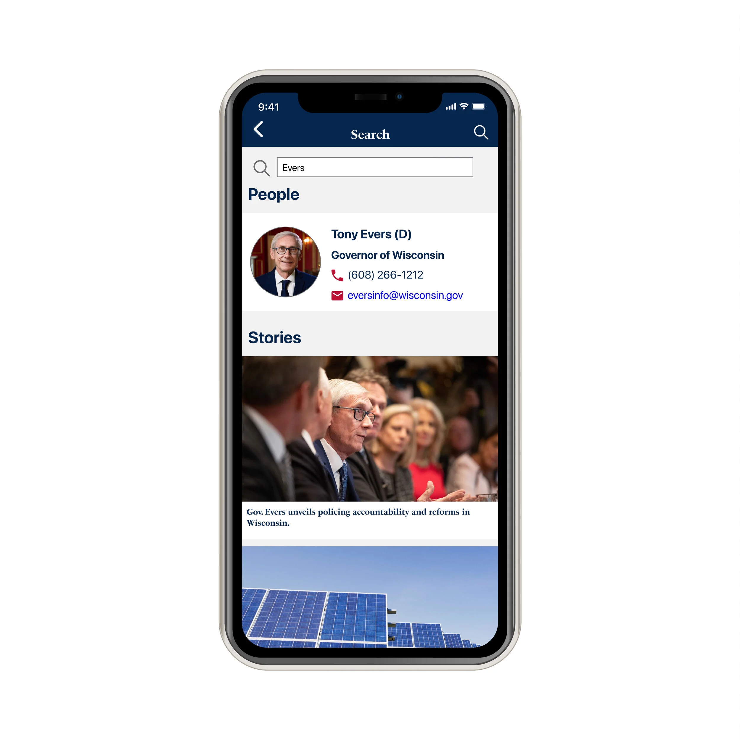
Further development of Interaction Patterns led to the creation of our low-fidelity prototype. We conducted prototype interviews to evaluate our current design and generate ideas for improvement. Pictured below are the prototype screens displaying the introductory quiz, various screens accessible from the bottom navigation bar and the search feature.
Design Validation
Based on our low-fidelity prototype interviews, we had the following key insights:
The need to change from “Local News” and “National News” to “Local” and “State”
Clarification on how the My Representatives section should be structured.
Representatives from the State Assembly and Senate should be shown before U.S. Representatives and Senators.
The importance of improving the hierarchy of images and words in our content.
Ideas about how calls to action and search could be better implemented into the application.
Shown below is an updated User Environment Design that reflects these design changes:
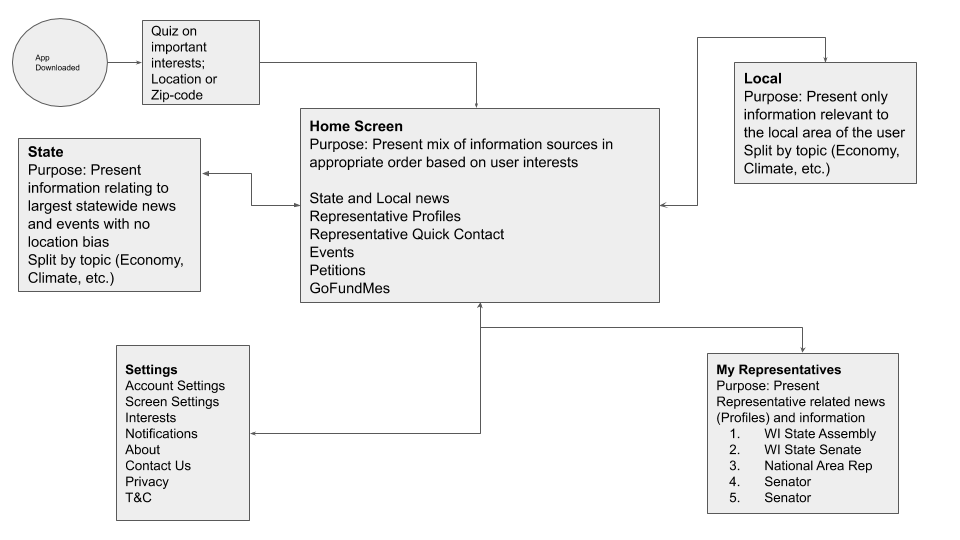
User Environment Design #2
Design Outcome
Our app solves the following user needs that were identified in our research:
Users seek unbiased news sources that empower them to form their own opinions.
Users like to get their news in an easy to read format and from an interface that is easy to use.
Users have different areas of interest and prefer to get news that is relevant to them.
Users love to stay up-to-date with topics that interest them.
Based on these key findings, we came up with the following feature designs that we would include in our app:
To meet our users' preferences for unbiased news sources, we would create our own original content for our app. This content would be produced by in-house content creators who focus on the facts and avoid inserting their own personal views.
We would create an intuitive user interface based on common mental models, helping users easily navigate through the app. We would provide easy to read articles and content. Since users grasp content more easily when they can visualize it, we would incorporate visuals aids like graphs, tables, and images.
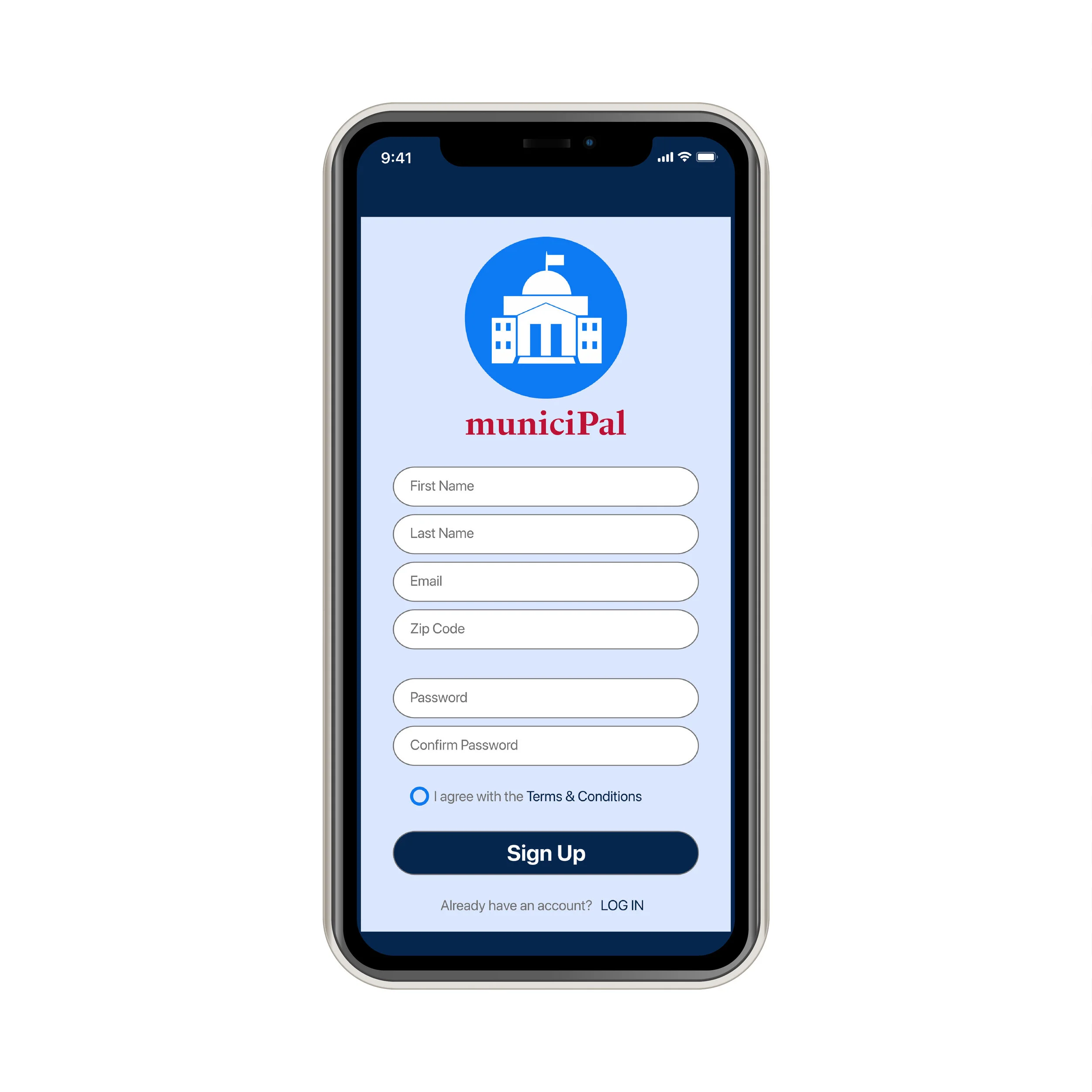
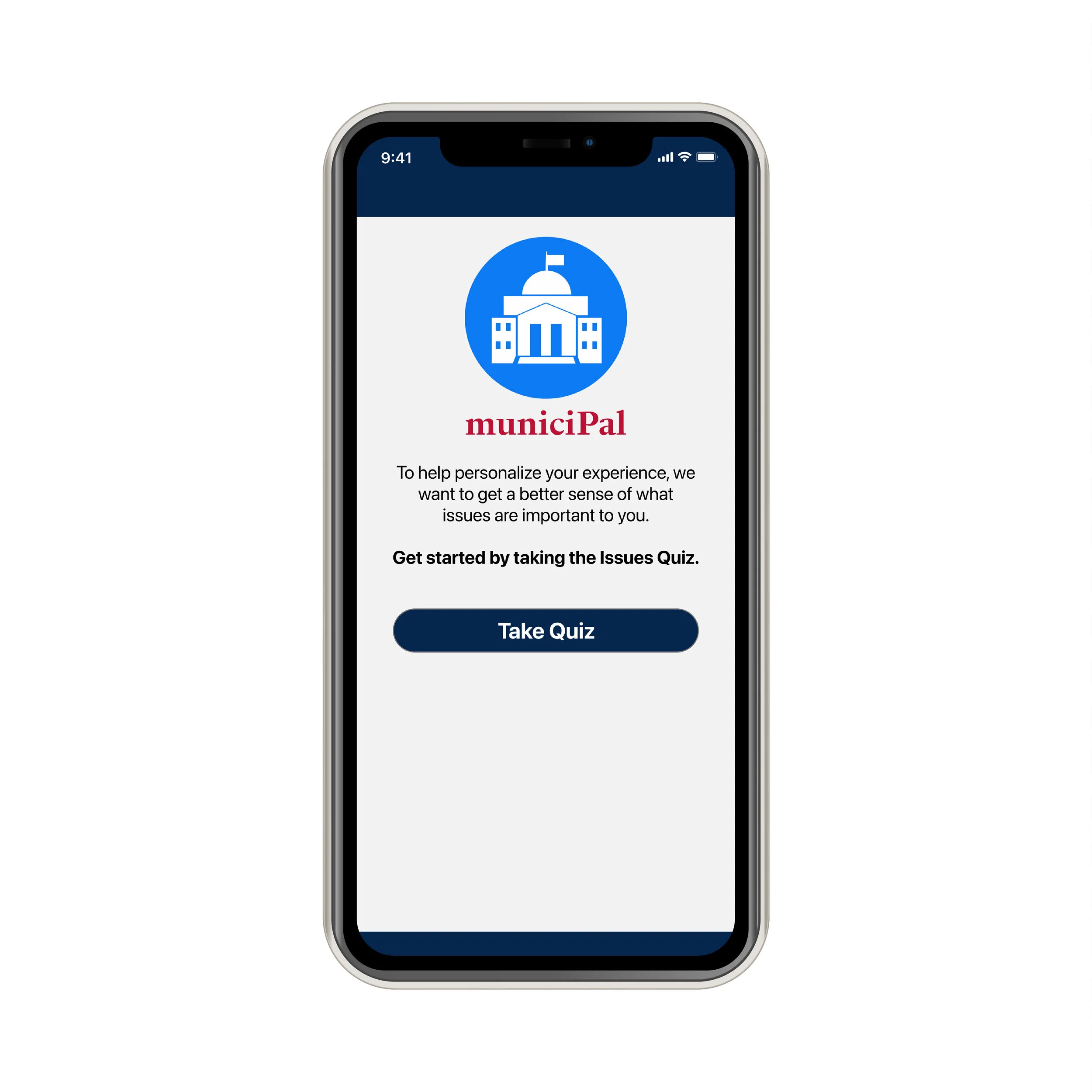
To incorporate user preferences, our app requires users to take a quiz after they sign up that allows them to select from a list the topics and issues that are most important to them. Based on the results of the quiz, the app will prioritize a content in a user’s feed based on their preferences. Users can manually change their preferences in Settings.
To help users stay up-to-date, users will have the option to receive push notifications for new content related to issues and topics they have selected in their preference settings.
Final Prototype
Signing Up and Selecting Issues
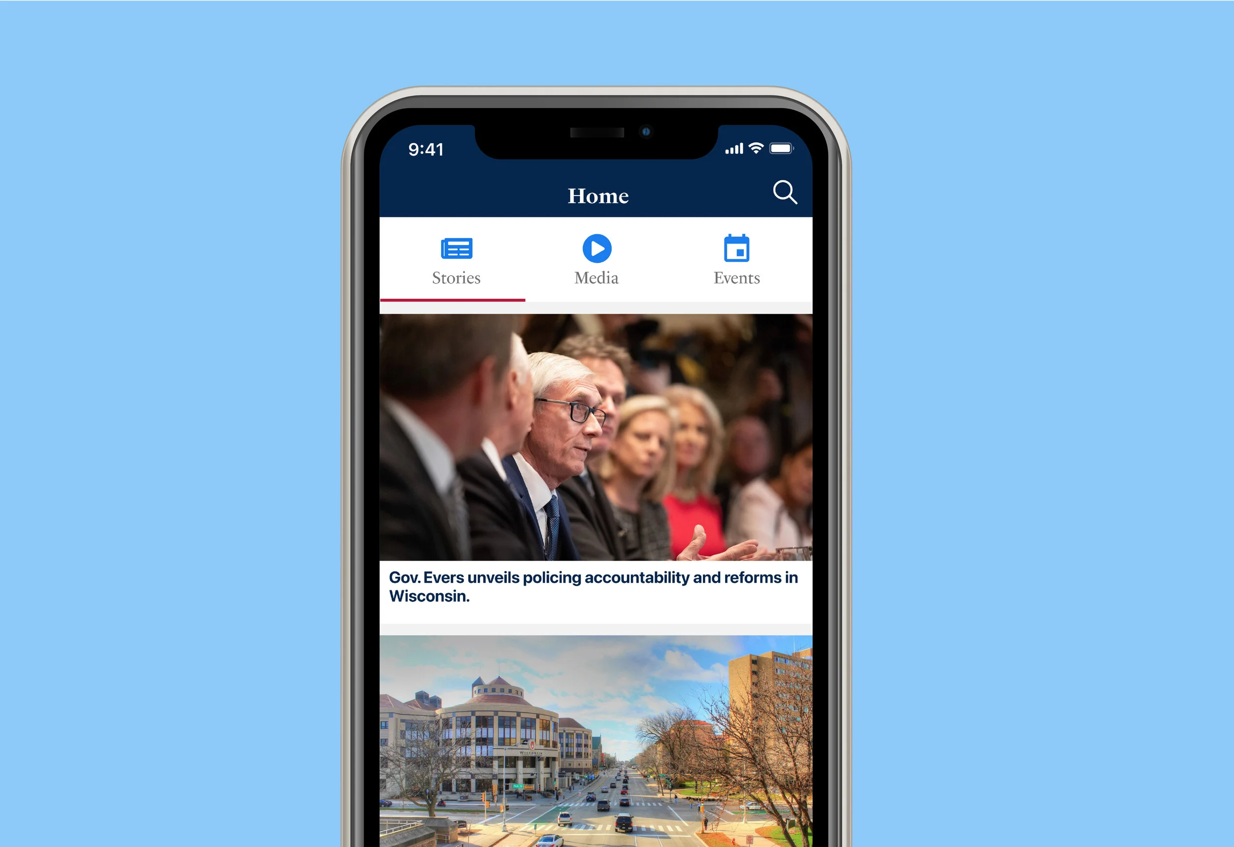
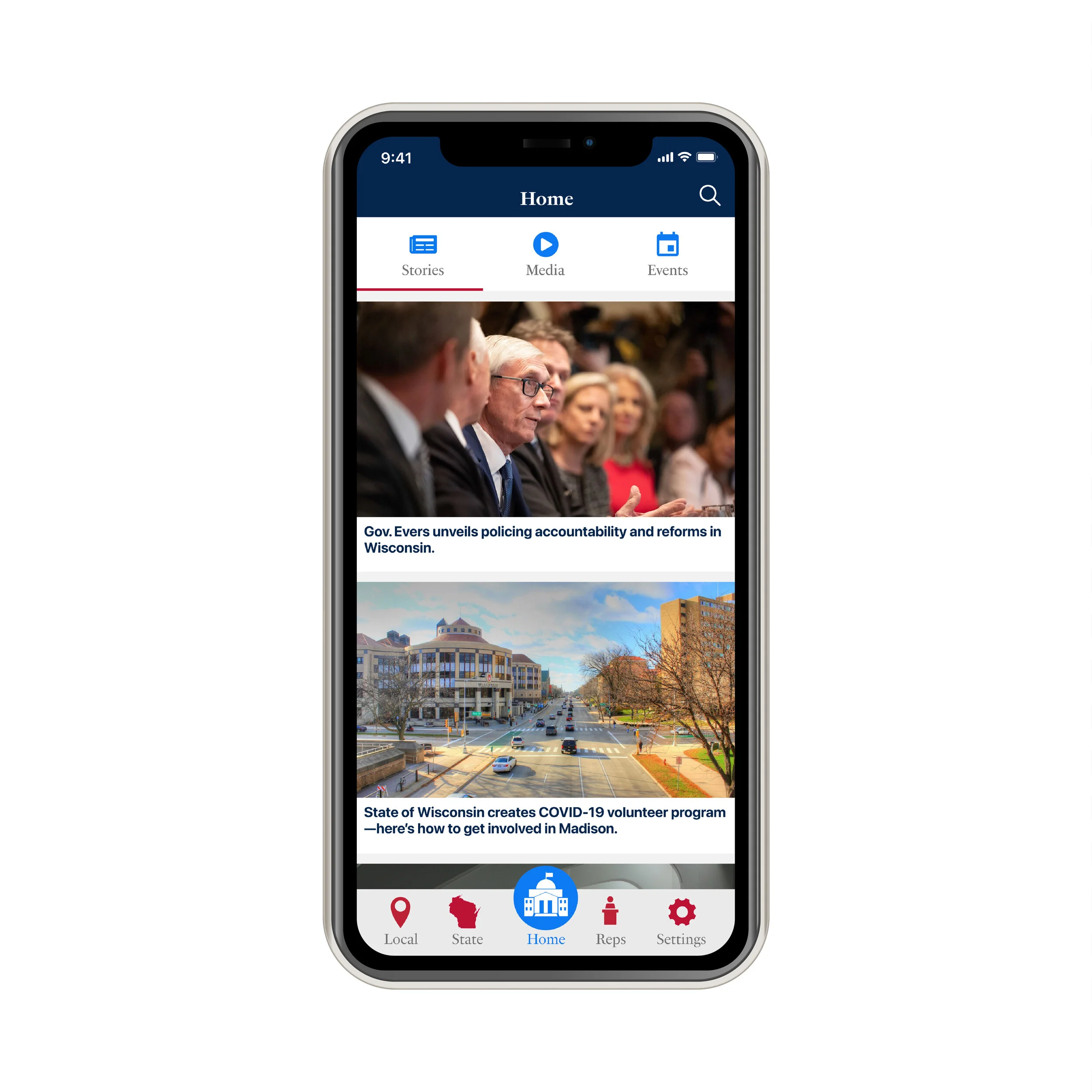
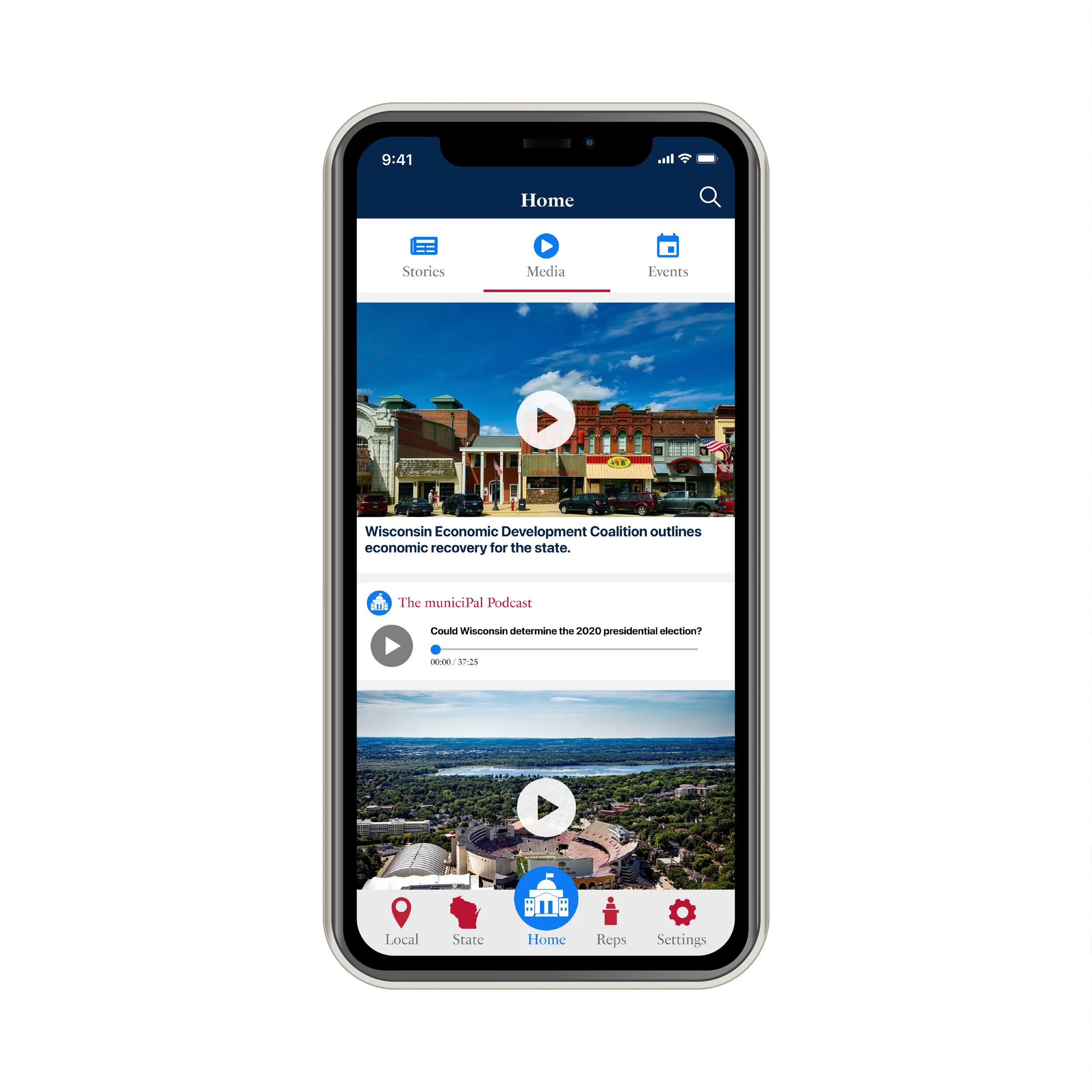
Home (Stories, Media, Events)
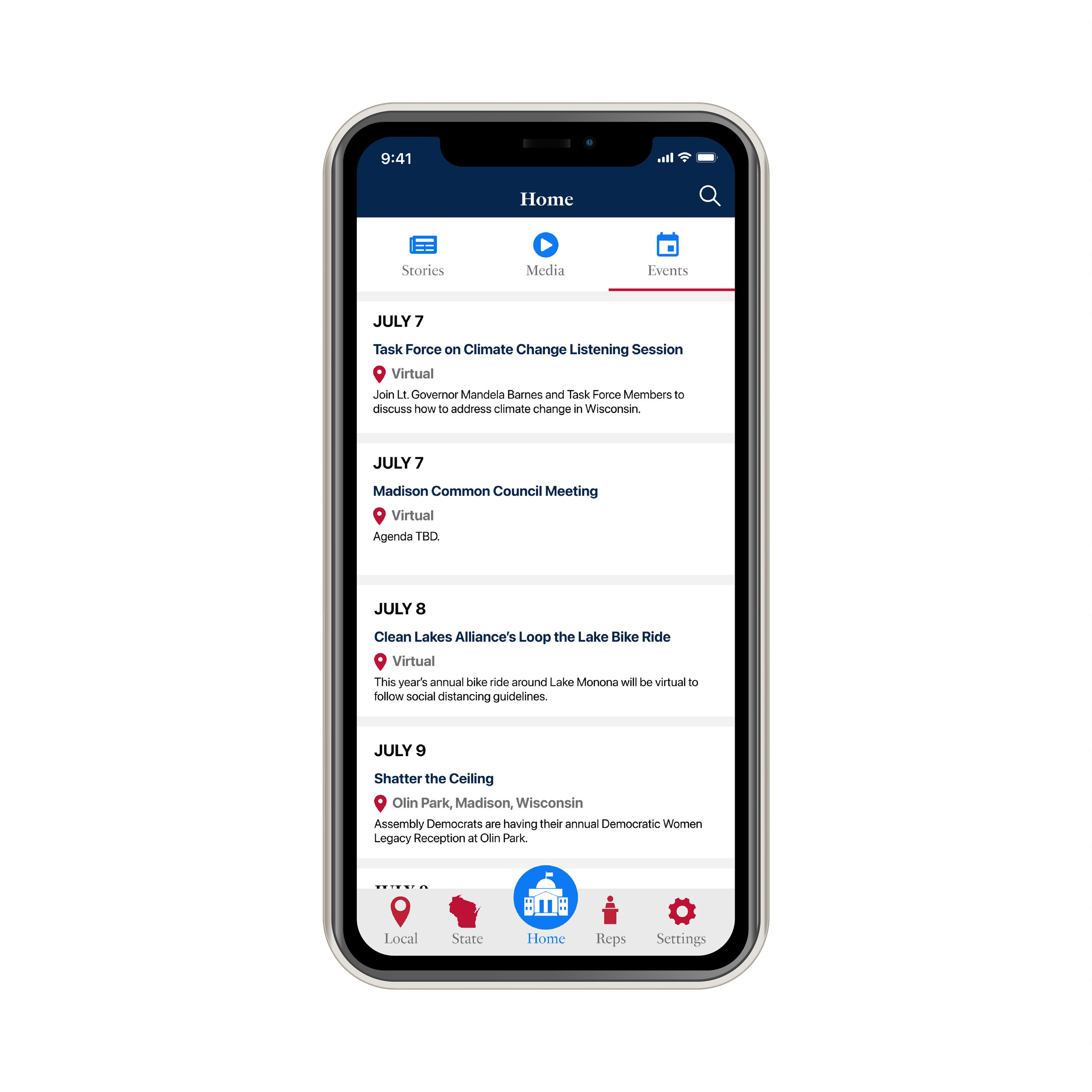
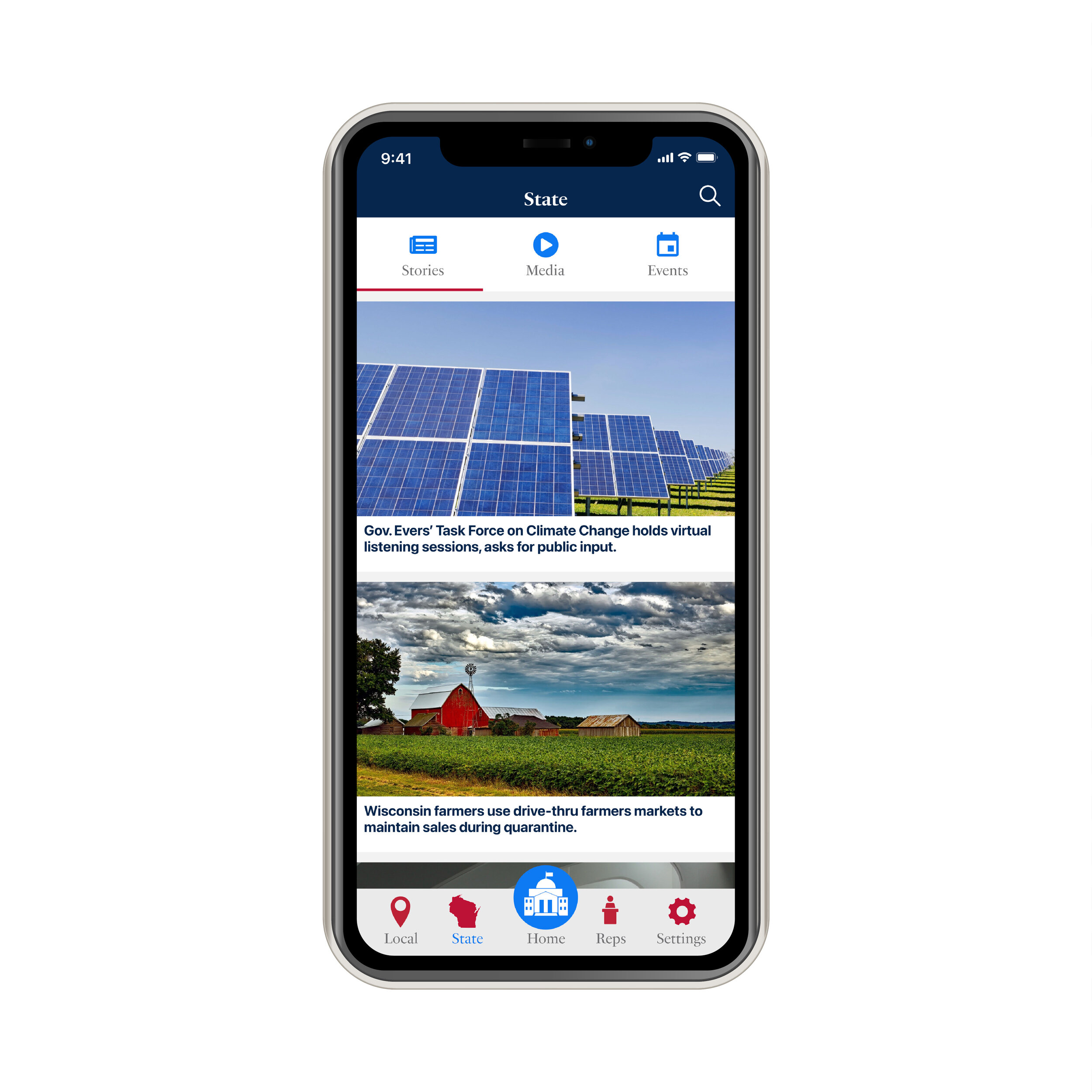
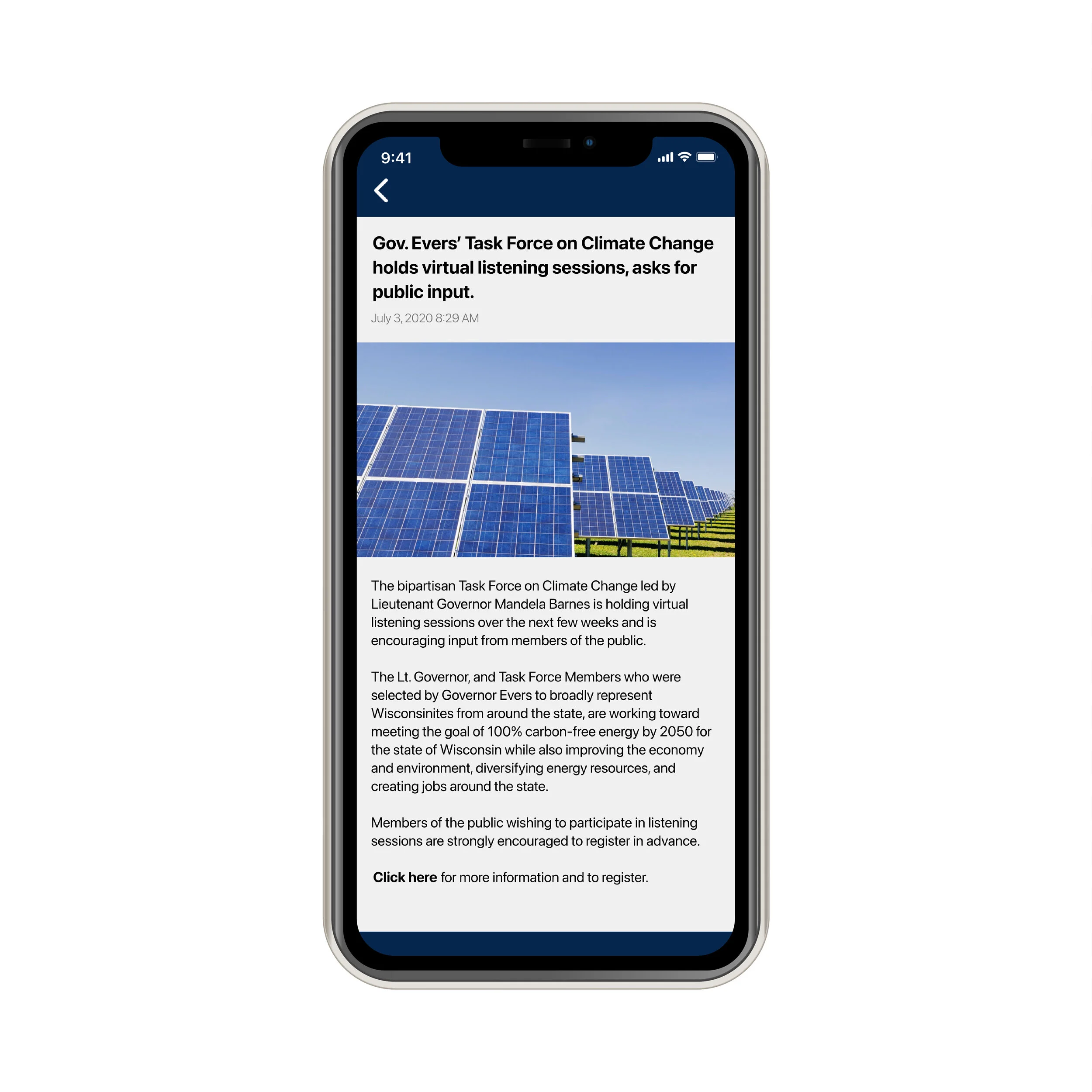
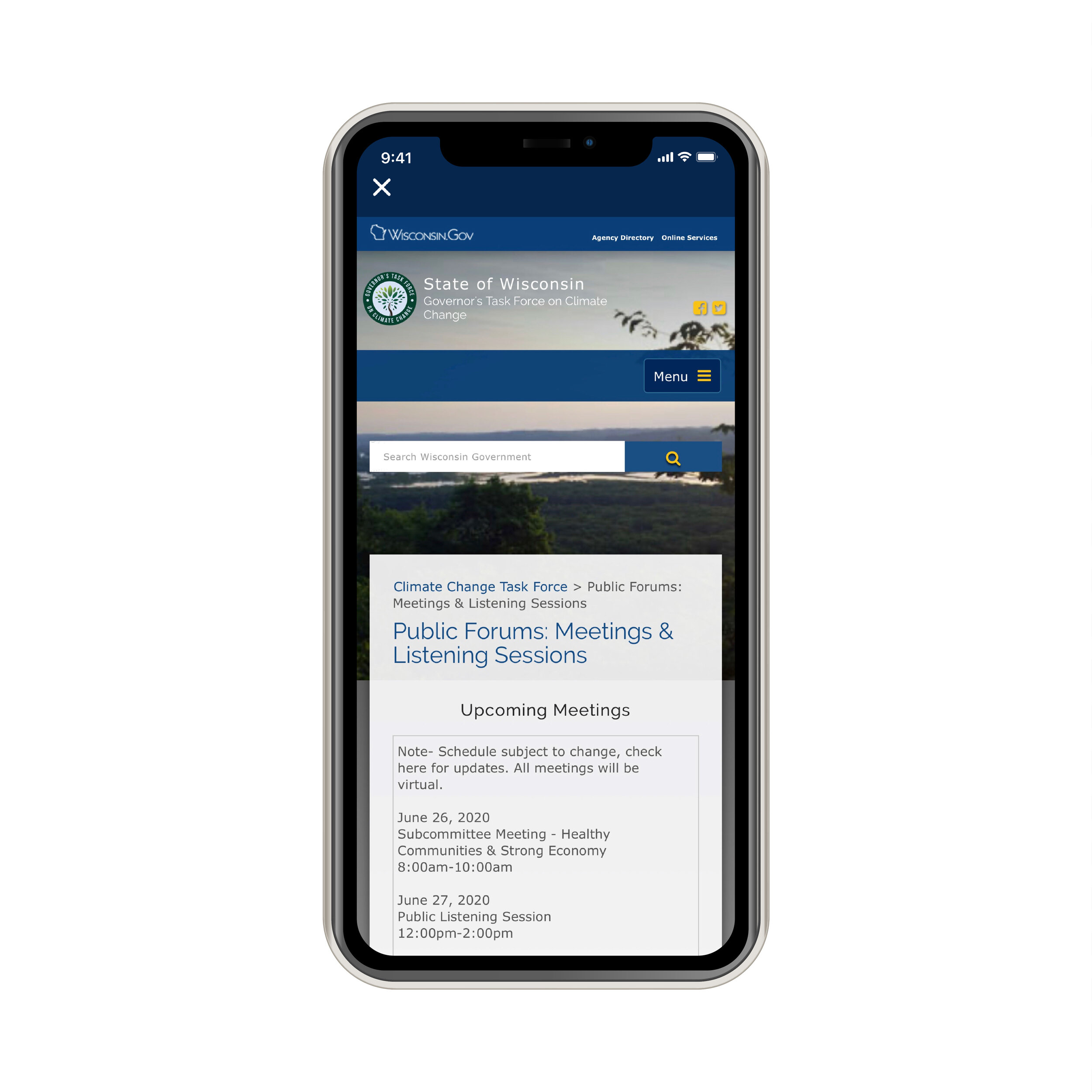
Call to Action: Getting the Public Engaged
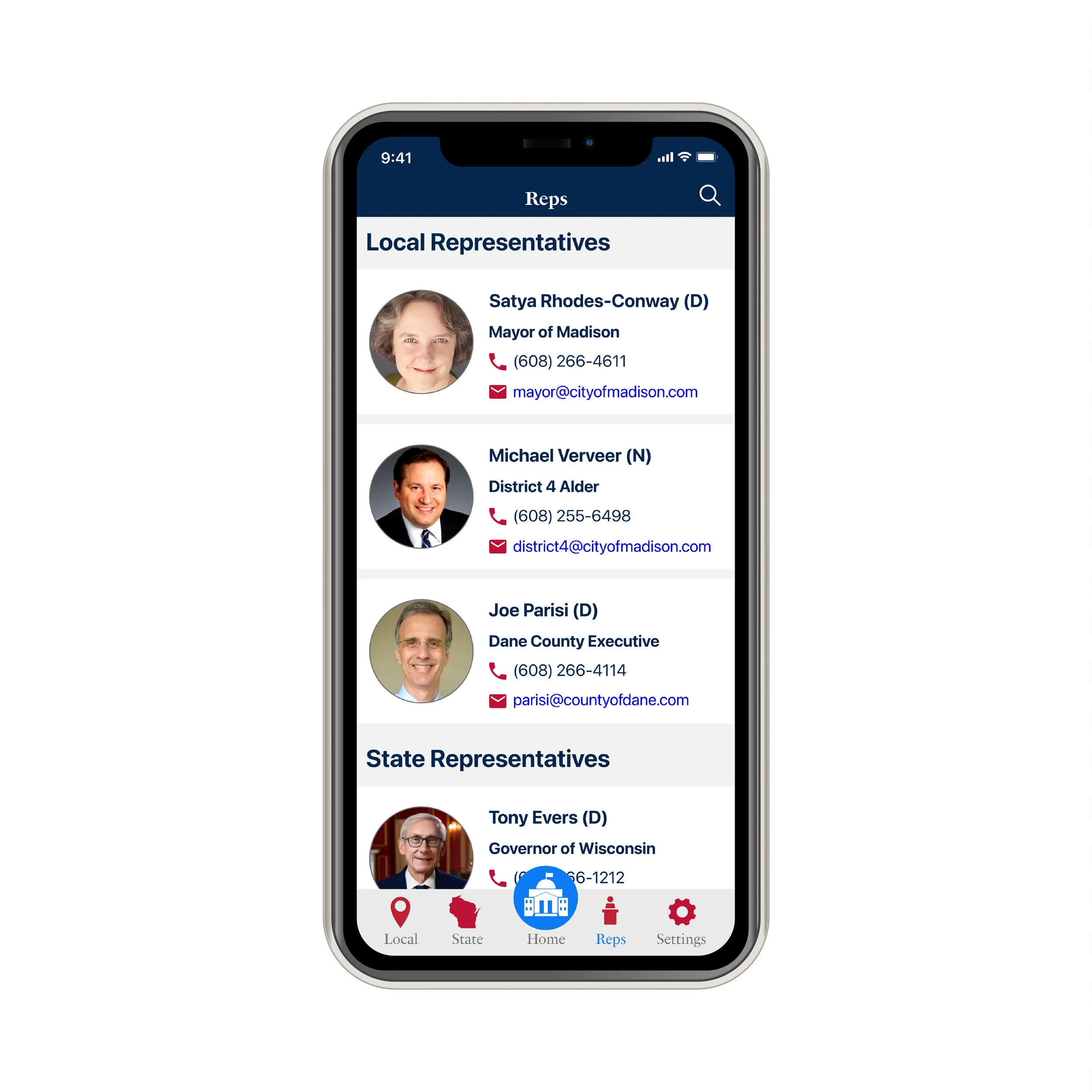
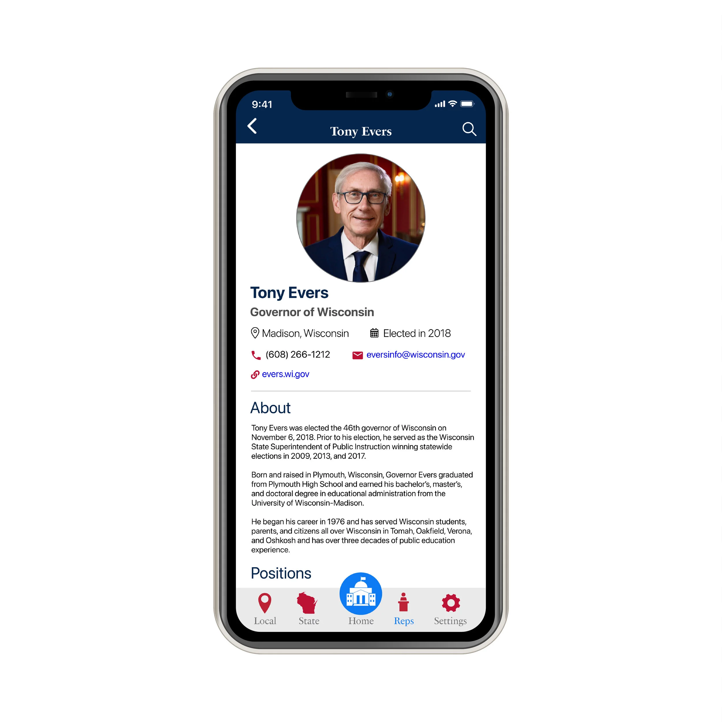
Meet Your State and Local Representatives
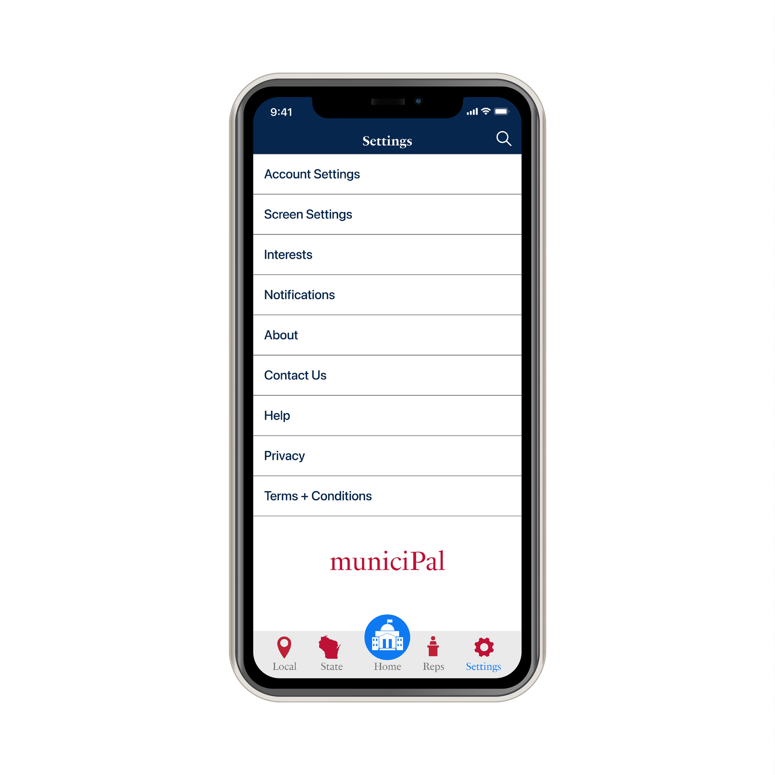
Search + Settings